“The Color We Lost”
Not long ago I was going through old family slides. Not mine — someone else’s, bought at random at a flea market. Shots from the sixties: a street, cars, a shop window, people at a crosswalk.
And the first thing that stopped me wasn’t the scenes themselves.
Color.
More precisely — its density.
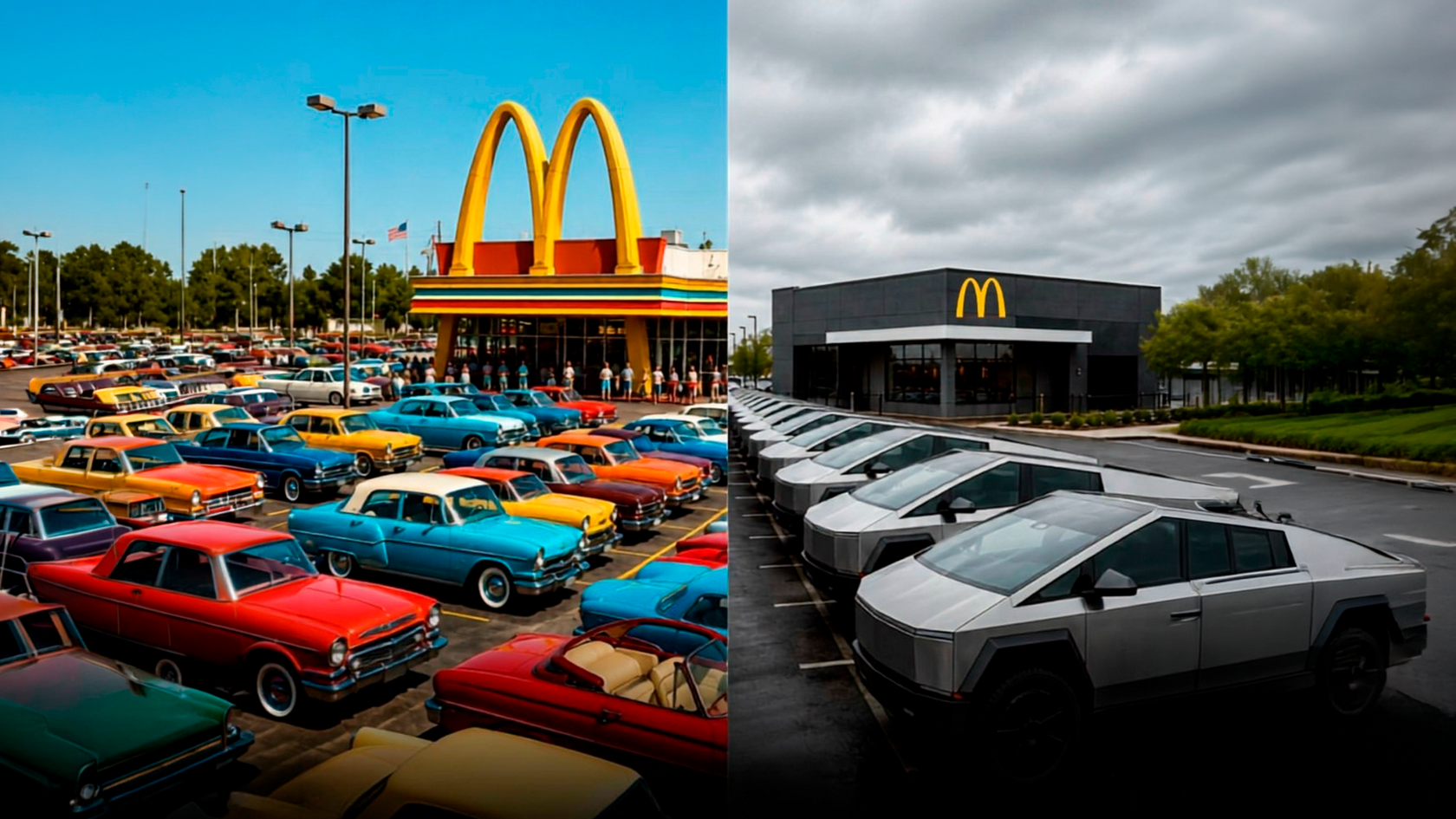
A turquoise Ford, a cream façade, an orange sign, a woman in a mustard coat, a red telephone booth on the corner. All of it existed at once, in a single frame, with no attempt to “match.” The world looked as if every object had the right to its own color.
I looked out the window at the street outside. The cars were graphite, silver, black, occasionally dark blue. The façades were beige and gray. The signs were white on black. The doors were metal-toned.
And I caught myself thinking something I didn’t want to finish:
It seems we really have lost something. Though I’m not sure it’s exactly color.
Maybe the past wasn’t as colorful as memory has made it. The film emulsions of those years sometimes over-saturated the hues, and the fading of the dyes created that warm palette we now accept as an “honest past.”
Maybe the present isn’t that gray either — it just distributes color differently.
But why, then, does the contrast feel so convincing?
Why, looking at an old slide, do I feel I’m seeing a world with more visual events per square meter?
We’ve Grown Accustomed to Gray
I won’t list everything — cars, buildings, offices, gadgets, packaging. That would be too easy a target.
The mechanism matters more.
When I was a child, a new car appearing in our courtyard was an event — partly because it had a color.
“The blue Lada.”
“The red Moskvich.”
“The beige Volga.”
Color was part of recognition, almost a name.
Today I can’t remember the color of my neighbor’s car. Not because I’ve become less attentive. More because color has stopped being information.
The modern street is designed so that visual differences are often reduced to a minimum. Not out of malice. Simply because function has defeated character.
And we’ve gotten used to it.
So much so that a colorful building starts to look provincial, and a bright sign seems tasteless. Neutrality has become synonymous with adequacy.
What once seemed unusual has gradually become the norm. And then — almost the only acceptable option.
Color Was Never Just Color
In the old city, color worked as navigation. Before you read the name, you already knew: the green pharmacy, the red bakery, the blue grocery.
Color moved faster than text.
It warned: yellow curb, red sign, striped tape.
It identified: the tram route, the doors of this entrance, the taxis of a city.
It tied place to memory: the zinc roofs of Paris, the shutters of Marseille, the tiles of Lisbon.
Color wasn’t decoration; it was an interface — a way for people to interact with their environment.
It organized space no less than form. Sometimes more.
And that’s where things get interesting.
Why Modernity Loves Neutrality
I’m not going to attack minimalism. That would be too simple — and unfair.
Neutrality is often a very rational design decision.
A gray façade doesn’t argue with its surroundings. Beige packaging doesn’t risk going out of style in a season. A black smartphone sells in different markets without adaptation. A glass office tower looks “modern” almost anywhere on earth.
Neutrality is universality, scalability, commercial safety.
It’s not a mistake. It’s a strategy.
And that’s exactly why the problem is more interesting than a simple “gray is bad.”
Minimalism was born, in part, from a desire to escape visual noise. The wish for silence, emptiness, pause — that’s deeply human.
But when the pause becomes endless, it stops being a pause.
It becomes an absence.
The Central Paradox
I put it to myself like this:
We have learned to produce nearly any color. And at the same time, we’ve started using fewer and fewer colors around us.
Dyes, digital palettes, LED lighting, coatings, polymers — today we can reproduce almost any shade.
And what do we choose?
RAL 7016. Anthracite gray.
This is no longer a technological limitation. It’s a cultural choice.
We’ve decided that restraint looks more dignified than variety. That the universal is better than the local. That the safe is smarter than the risky.
Maybe we’re right.
But every choice has consequences.
The Past Without Nostalgia
I don’t want to paint a false picture.
The fifties, sixties, seventies were not a “wonderful colorful world.” There were gray housing blocks, identical furniture, institutional paint in stairwells, mass standardization.
The past wasn’t always colorful.
It was colorful in places — but in those places, color worked at full strength.
So the more interesting question is:
Why did different eras choose different colors for things that today often strive to look the same?
A stairwell door might have been dark green not because someone aimed for art, but because that was simply the paint available — and because a green door differed from the neighbor’s brown one.
A bus was yellow so it could be seen in traffic. A tram was red so you couldn’t confuse it.
Color was born from the need to distinguish.
Modern design solves that same task differently — with graphics, logos, typefaces, wayfinding.
Color, it seems, is no longer needed.
But something went away with it.
Color as Memory
Here’s a scene I remember myself.
My grandmother’s kitchen.
Cabinets covered in film the color of pale turquoise. A table with a gray-blue top. A white refrigerator with rounded shapes, though in memory it has somehow turned beige.
I don’t just remember the kitchen.
I remember its color.
And everyone has an archive like that: the red telephone in the hallway, the yellow minibus at the stop, the green gate, the blue “Shoe Repair” sign, the cherry-red intercity bus.
Color is not just an attribute of memory.
It becomes its structure.
So when I say we’ve lost color, I don’t mean only aesthetics.
I mean we are losing the visual markers of our own lives.
The new environment leaves fewer such hooks. It doesn’t argue with memory.
It simply doesn’t provoke it.
Color and Identity
A city is recognized not only by its architecture.
Lisbon is not just streets and hills. It is white walls punctuated by azulejos.
Marrakesh is the terracotta walls.
Copenhagen is the ochre façades of Nyhavn.
Buenos Aires is the brightly painted houses of La Boca.
Take away the color, and cities begin to become interchangeable.
And that is already happening.
The global business district looks more and more the same everywhere: glass, steel, gray stone.
When sameness spreads beyond the business district — to residential blocks, shops, cafés — a question arises:
What remains of a place’s character?
Not that I want to bring back “colorful façades for tourists.” That would be mere stage scenery.
What interests me is different:
At what point did we decide that a place has no right to color unless that color is approved by “good taste”?
Not a Call to “Bring Back Color”
I don’t want to turn the ending into a manifesto.
No “let’s paint the world.” That would be too banal. And it would turn observation into a slogan.
I want to stay with the question that won’t leave me alone.
We walk down the street. Around us — a restrained, rational, safe visual environment. It doesn’t irritate, doesn’t argue, doesn’t intrude.
It is polite.
Yet we long for the frames of other people’s slides, where every object had its own color and its own singularity.
We buy filters that imitate old film. We travel to cities that have kept their “colorfulness.” We photograph doors nobody makes anymore.
Perhaps the problem is not that the world has turned gray.
Perhaps the problem is that we have stopped noticing how much alike everything has become.
And if we are indeed designing the future — and we do it every day, choosing another “universal” shade, another “safe” façade, another “timeless” palette — then maybe we should ask:
Should we design it only to be more efficient? Or also more distinct, alive, memorable?
I closed the box of slides.
Outside, it was getting dark, and the street was turning monochrome — but for a different, natural reason.
And I caught myself remembering the color of my grandmother’s kitchen better than the color of the last café where I had coffee.
That’s exactly the point.
And the first thing that stopped me wasn’t the scenes themselves.
Color.
More precisely — its density.
A turquoise Ford, a cream façade, an orange sign, a woman in a mustard coat, a red telephone booth on the corner. All of it existed at once, in a single frame, with no attempt to “match.” The world looked as if every object had the right to its own color.
I looked out the window at the street outside. The cars were graphite, silver, black, occasionally dark blue. The façades were beige and gray. The signs were white on black. The doors were metal-toned.
And I caught myself thinking something I didn’t want to finish:
It seems we really have lost something. Though I’m not sure it’s exactly color.
Maybe the past wasn’t as colorful as memory has made it. The film emulsions of those years sometimes over-saturated the hues, and the fading of the dyes created that warm palette we now accept as an “honest past.”
Maybe the present isn’t that gray either — it just distributes color differently.
But why, then, does the contrast feel so convincing?
Why, looking at an old slide, do I feel I’m seeing a world with more visual events per square meter?
We’ve Grown Accustomed to Gray
I won’t list everything — cars, buildings, offices, gadgets, packaging. That would be too easy a target.
The mechanism matters more.
When I was a child, a new car appearing in our courtyard was an event — partly because it had a color.
“The blue Lada.”
“The red Moskvich.”
“The beige Volga.”
Color was part of recognition, almost a name.
Today I can’t remember the color of my neighbor’s car. Not because I’ve become less attentive. More because color has stopped being information.
The modern street is designed so that visual differences are often reduced to a minimum. Not out of malice. Simply because function has defeated character.
And we’ve gotten used to it.
So much so that a colorful building starts to look provincial, and a bright sign seems tasteless. Neutrality has become synonymous with adequacy.
What once seemed unusual has gradually become the norm. And then — almost the only acceptable option.
Color Was Never Just Color
In the old city, color worked as navigation. Before you read the name, you already knew: the green pharmacy, the red bakery, the blue grocery.
Color moved faster than text.
It warned: yellow curb, red sign, striped tape.
It identified: the tram route, the doors of this entrance, the taxis of a city.
It tied place to memory: the zinc roofs of Paris, the shutters of Marseille, the tiles of Lisbon.
Color wasn’t decoration; it was an interface — a way for people to interact with their environment.
It organized space no less than form. Sometimes more.
And that’s where things get interesting.
Why Modernity Loves Neutrality
I’m not going to attack minimalism. That would be too simple — and unfair.
Neutrality is often a very rational design decision.
A gray façade doesn’t argue with its surroundings. Beige packaging doesn’t risk going out of style in a season. A black smartphone sells in different markets without adaptation. A glass office tower looks “modern” almost anywhere on earth.
Neutrality is universality, scalability, commercial safety.
It’s not a mistake. It’s a strategy.
And that’s exactly why the problem is more interesting than a simple “gray is bad.”
Minimalism was born, in part, from a desire to escape visual noise. The wish for silence, emptiness, pause — that’s deeply human.
But when the pause becomes endless, it stops being a pause.
It becomes an absence.
The Central Paradox
I put it to myself like this:
We have learned to produce nearly any color. And at the same time, we’ve started using fewer and fewer colors around us.
Dyes, digital palettes, LED lighting, coatings, polymers — today we can reproduce almost any shade.
And what do we choose?
RAL 7016. Anthracite gray.
This is no longer a technological limitation. It’s a cultural choice.
We’ve decided that restraint looks more dignified than variety. That the universal is better than the local. That the safe is smarter than the risky.
Maybe we’re right.
But every choice has consequences.
The Past Without Nostalgia
I don’t want to paint a false picture.
The fifties, sixties, seventies were not a “wonderful colorful world.” There were gray housing blocks, identical furniture, institutional paint in stairwells, mass standardization.
The past wasn’t always colorful.
It was colorful in places — but in those places, color worked at full strength.
So the more interesting question is:
Why did different eras choose different colors for things that today often strive to look the same?
A stairwell door might have been dark green not because someone aimed for art, but because that was simply the paint available — and because a green door differed from the neighbor’s brown one.
A bus was yellow so it could be seen in traffic. A tram was red so you couldn’t confuse it.
Color was born from the need to distinguish.
Modern design solves that same task differently — with graphics, logos, typefaces, wayfinding.
Color, it seems, is no longer needed.
But something went away with it.
Color as Memory
Here’s a scene I remember myself.
My grandmother’s kitchen.
Cabinets covered in film the color of pale turquoise. A table with a gray-blue top. A white refrigerator with rounded shapes, though in memory it has somehow turned beige.
I don’t just remember the kitchen.
I remember its color.
And everyone has an archive like that: the red telephone in the hallway, the yellow minibus at the stop, the green gate, the blue “Shoe Repair” sign, the cherry-red intercity bus.
Color is not just an attribute of memory.
It becomes its structure.
So when I say we’ve lost color, I don’t mean only aesthetics.
I mean we are losing the visual markers of our own lives.
The new environment leaves fewer such hooks. It doesn’t argue with memory.
It simply doesn’t provoke it.
Color and Identity
A city is recognized not only by its architecture.
Lisbon is not just streets and hills. It is white walls punctuated by azulejos.
Marrakesh is the terracotta walls.
Copenhagen is the ochre façades of Nyhavn.
Buenos Aires is the brightly painted houses of La Boca.
Take away the color, and cities begin to become interchangeable.
And that is already happening.
The global business district looks more and more the same everywhere: glass, steel, gray stone.
When sameness spreads beyond the business district — to residential blocks, shops, cafés — a question arises:
What remains of a place’s character?
Not that I want to bring back “colorful façades for tourists.” That would be mere stage scenery.
What interests me is different:
At what point did we decide that a place has no right to color unless that color is approved by “good taste”?
Not a Call to “Bring Back Color”
I don’t want to turn the ending into a manifesto.
No “let’s paint the world.” That would be too banal. And it would turn observation into a slogan.
I want to stay with the question that won’t leave me alone.
We walk down the street. Around us — a restrained, rational, safe visual environment. It doesn’t irritate, doesn’t argue, doesn’t intrude.
It is polite.
Yet we long for the frames of other people’s slides, where every object had its own color and its own singularity.
We buy filters that imitate old film. We travel to cities that have kept their “colorfulness.” We photograph doors nobody makes anymore.
Perhaps the problem is not that the world has turned gray.
Perhaps the problem is that we have stopped noticing how much alike everything has become.
And if we are indeed designing the future — and we do it every day, choosing another “universal” shade, another “safe” façade, another “timeless” palette — then maybe we should ask:
Should we design it only to be more efficient? Or also more distinct, alive, memorable?
I closed the box of slides.
Outside, it was getting dark, and the street was turning monochrome — but for a different, natural reason.
And I caught myself remembering the color of my grandmother’s kitchen better than the color of the last café where I had coffee.
That’s exactly the point.
NOTES ON BEAUTY IN REAL LIFE
2026 © Iskandar Kadyrov • All rights reserved • RU / EN (18+)
See also